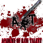
We use to take it to the streets with graffiti, now we take it online with graphic designing, photography, scanning, so show us what you got... Anything visual arts!
the first iron man seems a little too dark. maybe a better contrast of colors.
second iron man looks alot better, but now seems a little plain. maybe a little pizzazz or a different background will do it. maybe a space background, like a night sky with the stars and shit. might be pretty dope.
the third one, well, i think we've already gone over it a couple times. but thats nice. when you first made it i was suprised on the way you pieced it together. nice, everything seemed to mesh really well.
the fourth, fuckin sick. simple and effective. looks dope man. nothin else to really say on that one.
the nielz one is nice. has a dark feel to it. the colors blend well with one another. i like the presentation of it with the two guns on it. nicely done.
and the last one, well, fuck you. sick as fuck. i REALLY like that one. maybe just capatalize the I in ill, and shit should be nice. jus minor shit. but man when i first saw this one, i was like, "wow" just wow man. i dig it
I like the top Iron man one better... But the second one would look pretty dope if you maybe incorporated some kind of background to the image? Just a thought.
Im definitely liking the one for Loon. That color green is dope. The ill in the bottom right corner isn't seen as well as the rest. The one he is using now, the letters really jump out more in my opinion.
The one for 32 is tight, and I like the little saying at the bottom of it. Maybe you could make the guns stand out more? Im not sure if you could do that without having to lighten up the entire image though.
Oh, the anarchy one is fucking dope the way it is.
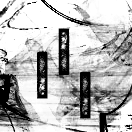
my favorite one is the one for loon e lou, the collectively ill could be slightly darker, just a bit, and maybe moved to the left like lika 2 pixels lol, the first warmachine looks better then the second, but the gradient in the back just isn't enough, makes it too simple and boring, the anarchy is whatever, i dont care for it much, reminds me of my quick sigs that i use to make for people lol, the one for 32 is decent but the words at the bottom could be worded a bit better and a little more clear, also the font for his name where the N is.. could be a little better adjusted to be eligible, i personally dont like the background for it, but that has little to nothin to do with the creation really, the last one is koo, seems u use similar brushes for it all, the abstract type, pretty much the style i prefer as well, but the collectively ill written on it could be fixed up, somethin about the word ill in it doesn't feel right, other than that.. good stuff, keep workin on it
I appreciate everyones advice... I'll keep working at them, eventually get to some banging ass ones. As for the iron man one, i was just proud of being able to blend the warmachine into the design itself, seeing as they were two different entities... but thanks for taking the time to critique.
i see you in here chefin up some good shit and well i was wondering if you'd make a sig for me please well not for me but just a bug on a leash being held by an enormous dragon maybe a few words or something
1. A little too dark on the left side. Maybe War Machine in front of the other pattern could've been nicer...like expanding the pattern to cover the whole Sig.
2. It's crazy how just changing the background color makes the whole piece look simpler...
3. This one is dope. Great choice of colors imo. Everything seems to blend together nicely...
4. Meh. I like the background. Not the (A) looking thing, but the red and black...
5.& 6. Both of these are dope as fuck. No real complaints on these, except on Neilz's, I think the name and the text at the bottom are too close together...and his 'n' looks like an 'h'
Like you said, you're starting out, but you're already dropping some pretty cool Sig's...keep going dude...
[ Post made via Mobile Device ]
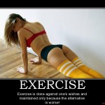
When Chuck Norris does a pushup, he isn't lifting himself up, he's pushing the Earth down!!!